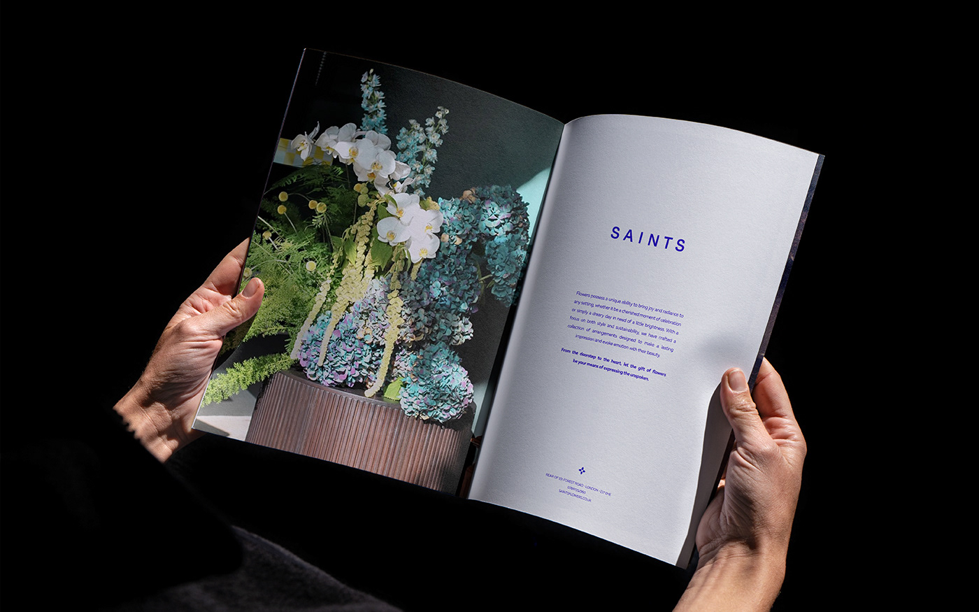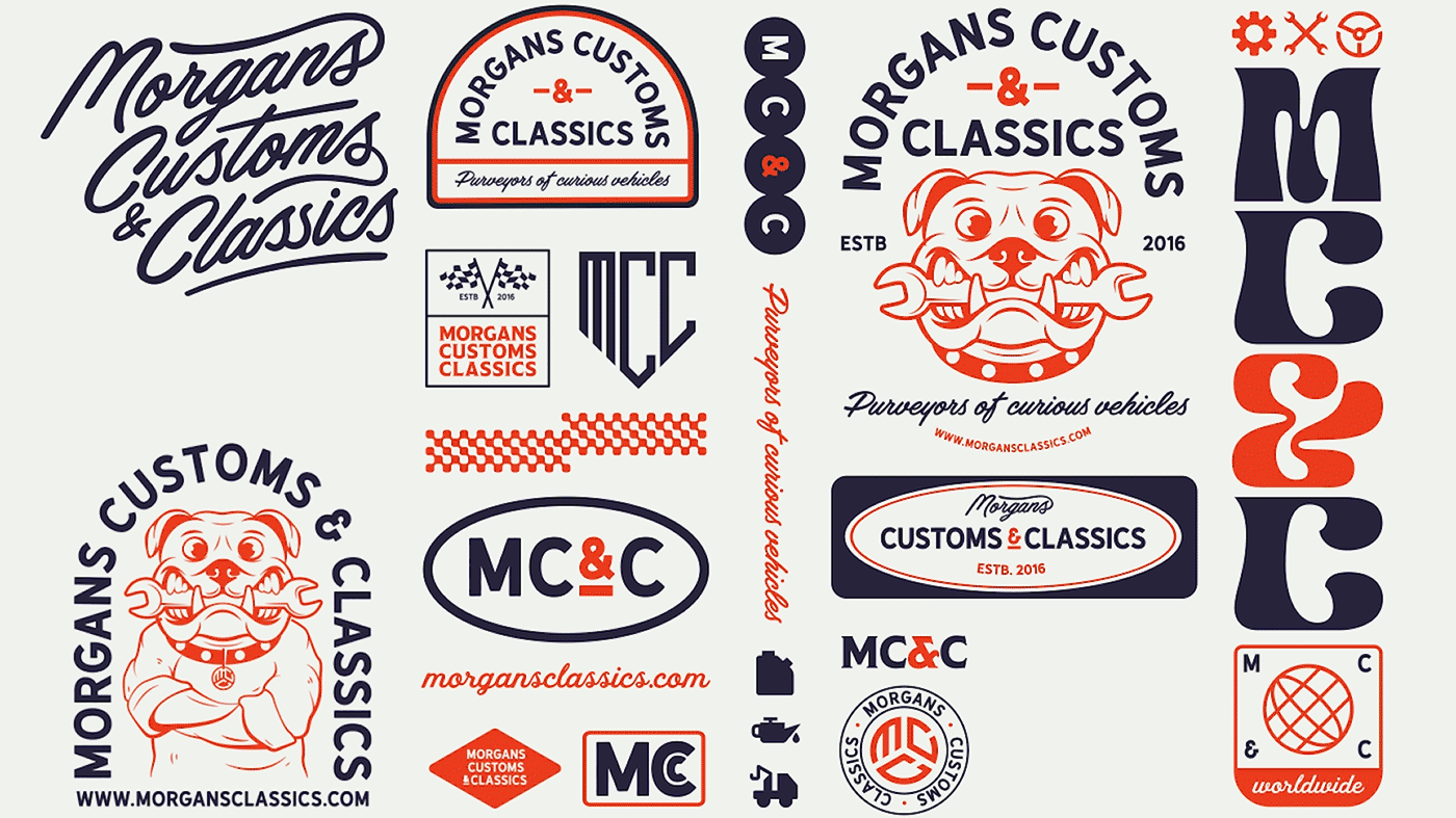
Saints is a botique flower shop in East London. They were in a branding quagmire and needed a refined visual language that aligned better with the brand's identity and connected
with their customers.
with their customers.
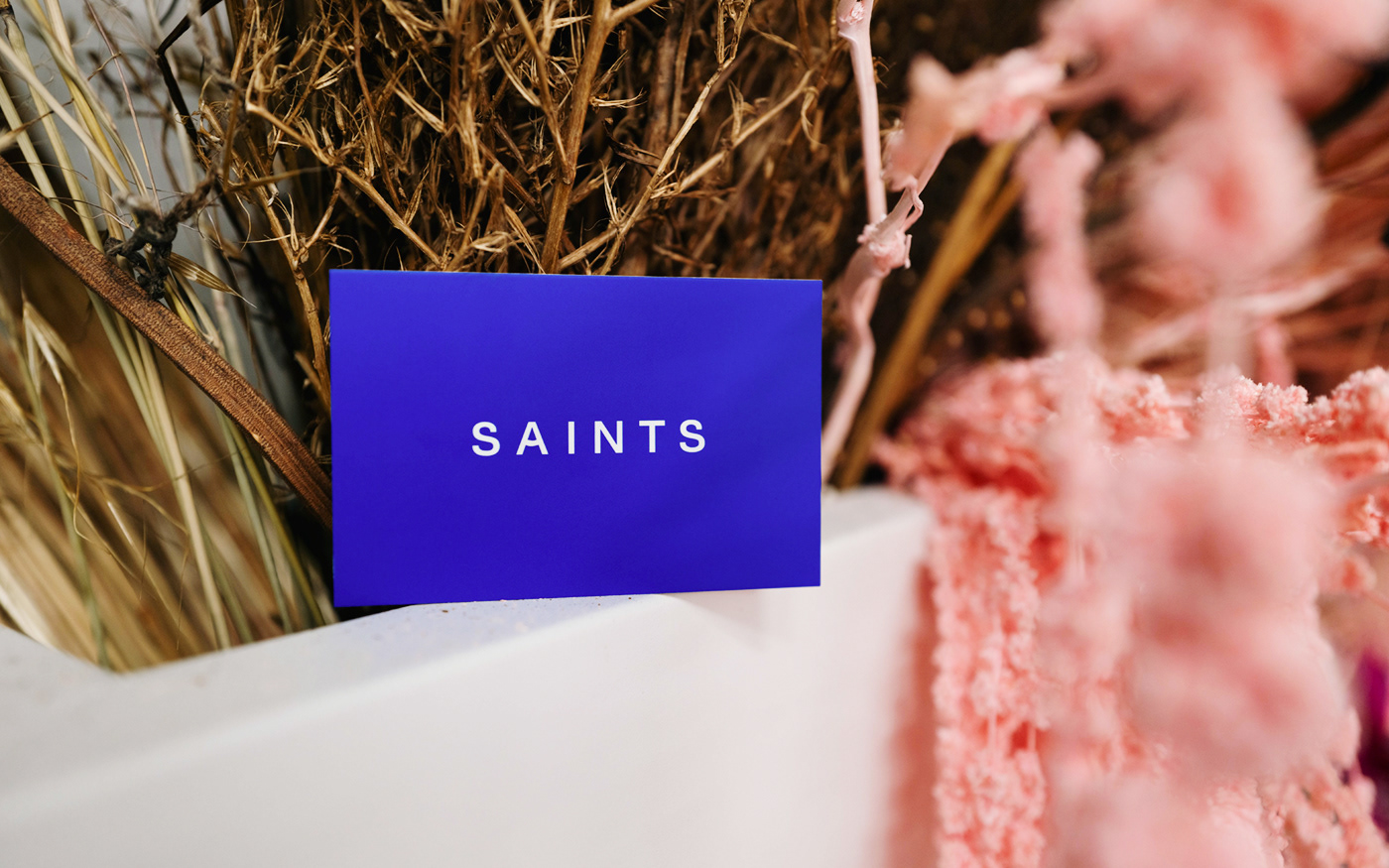
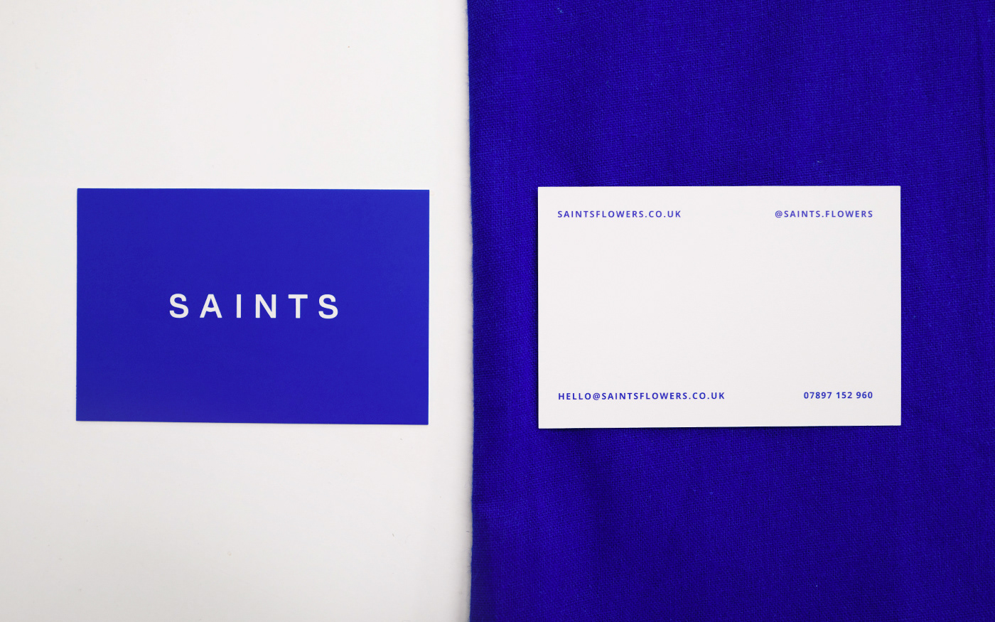
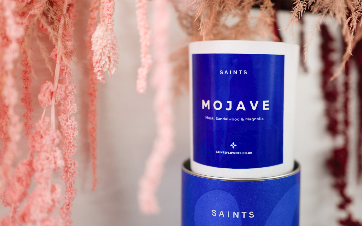
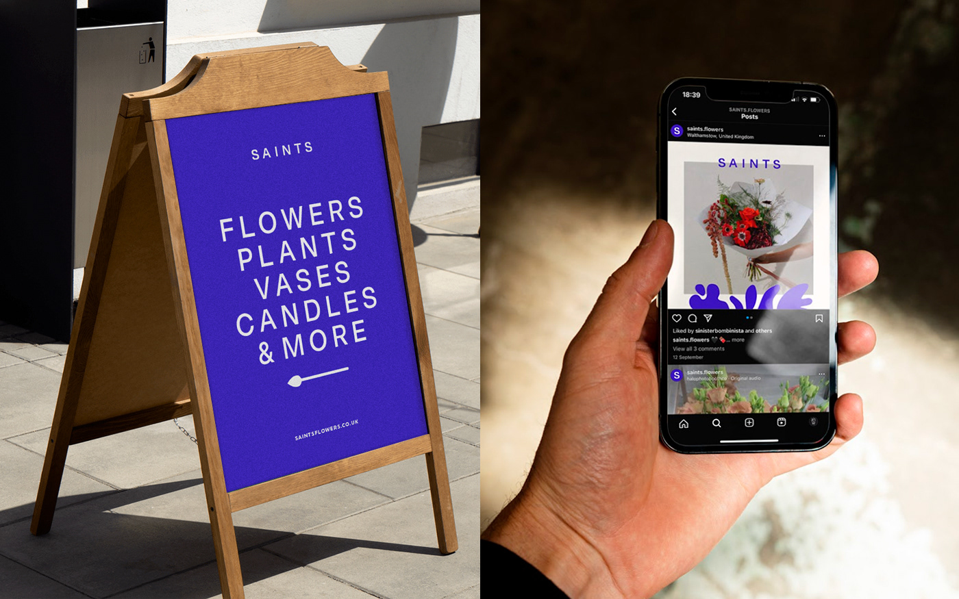
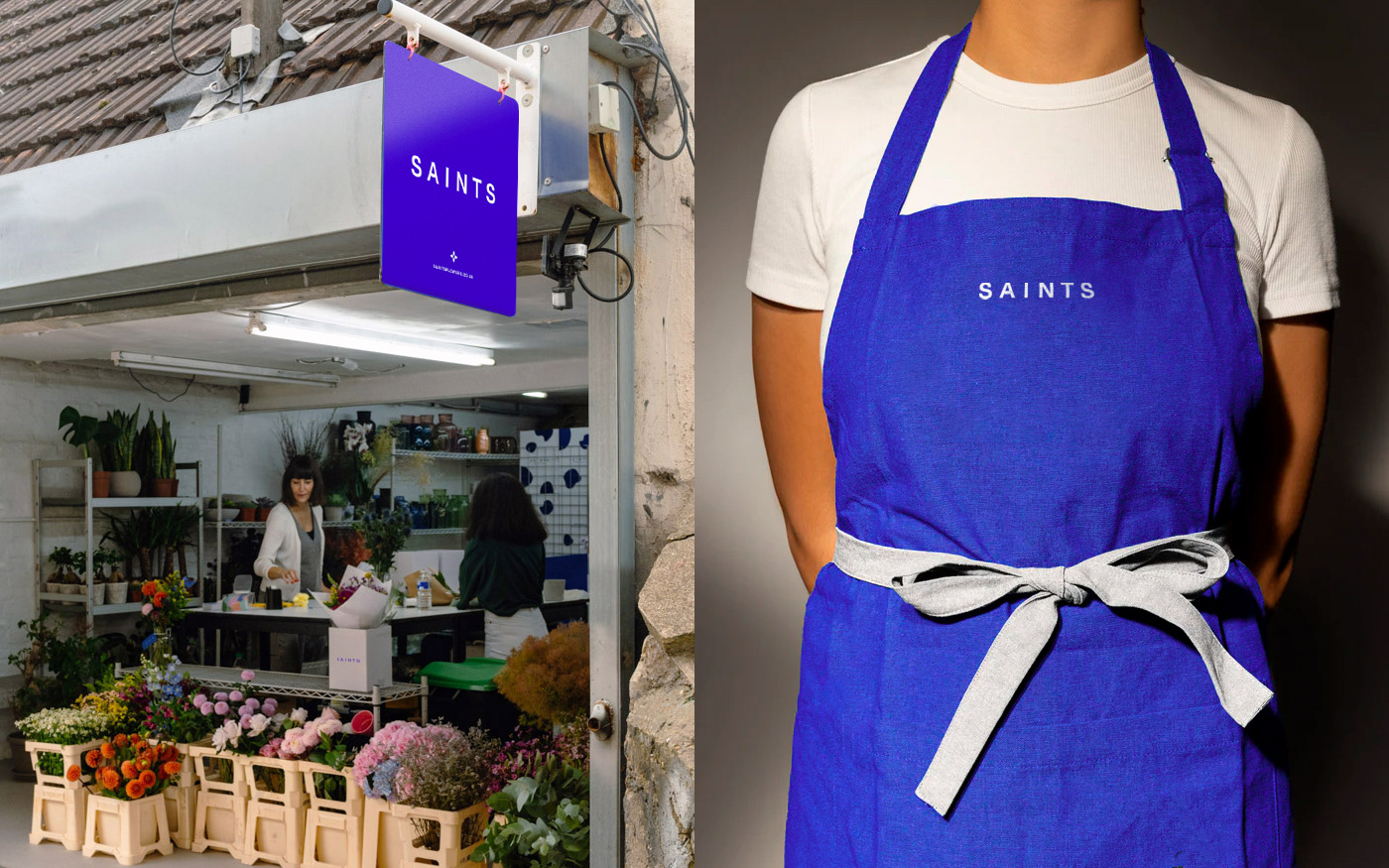
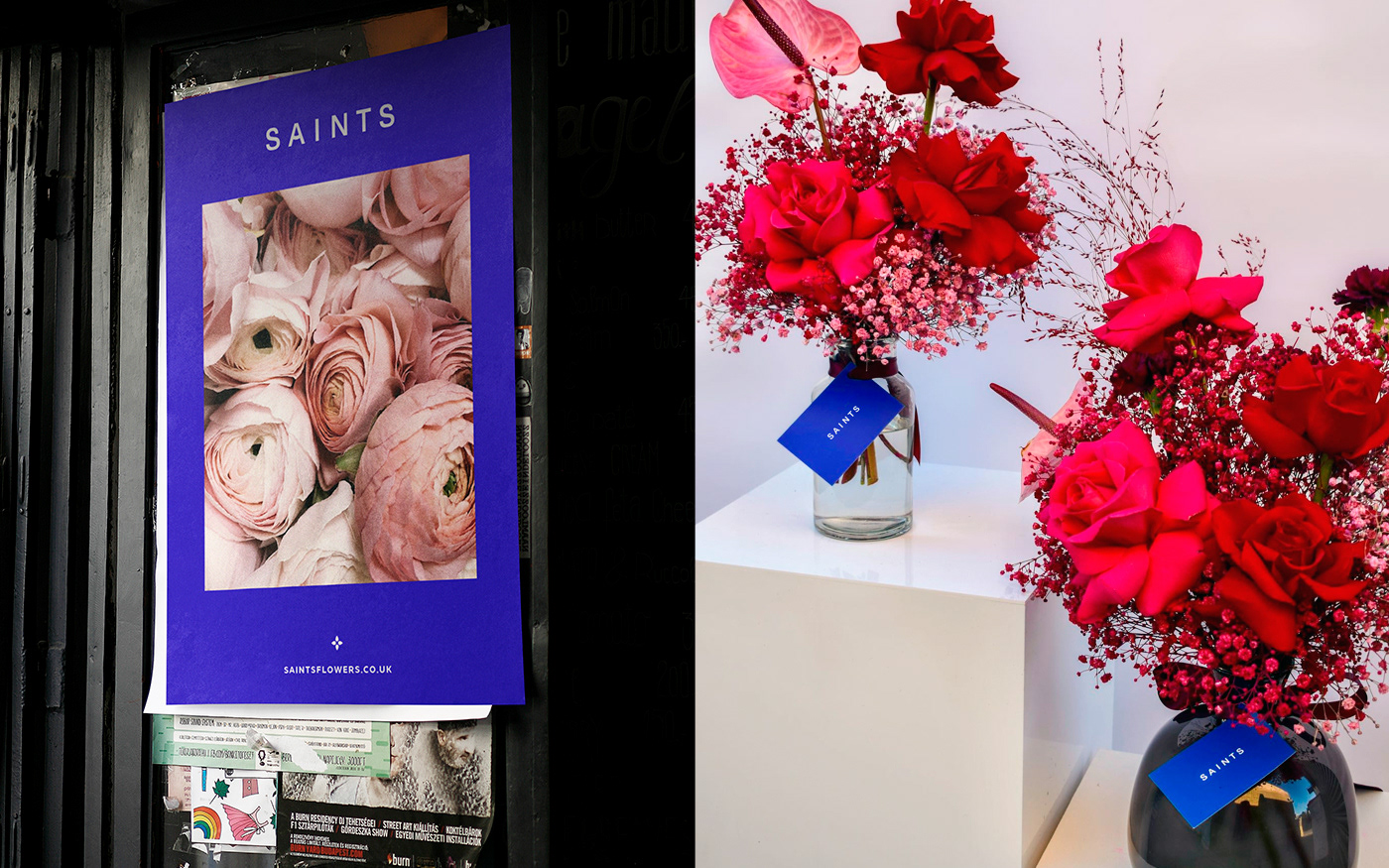
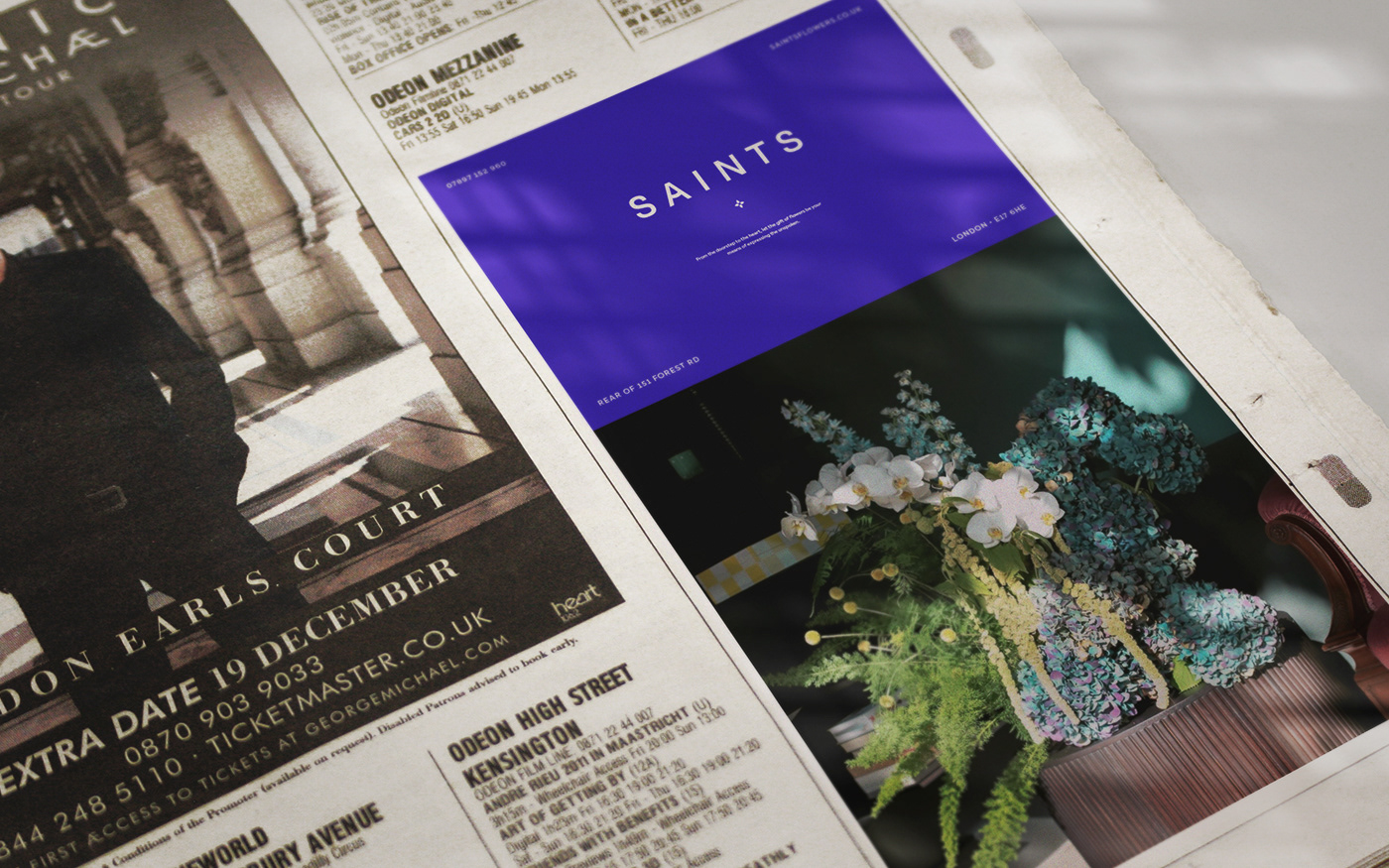
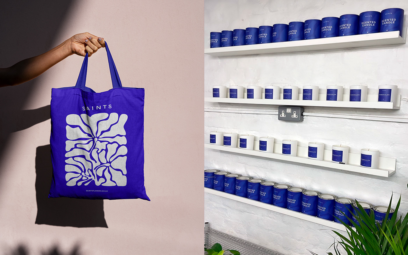
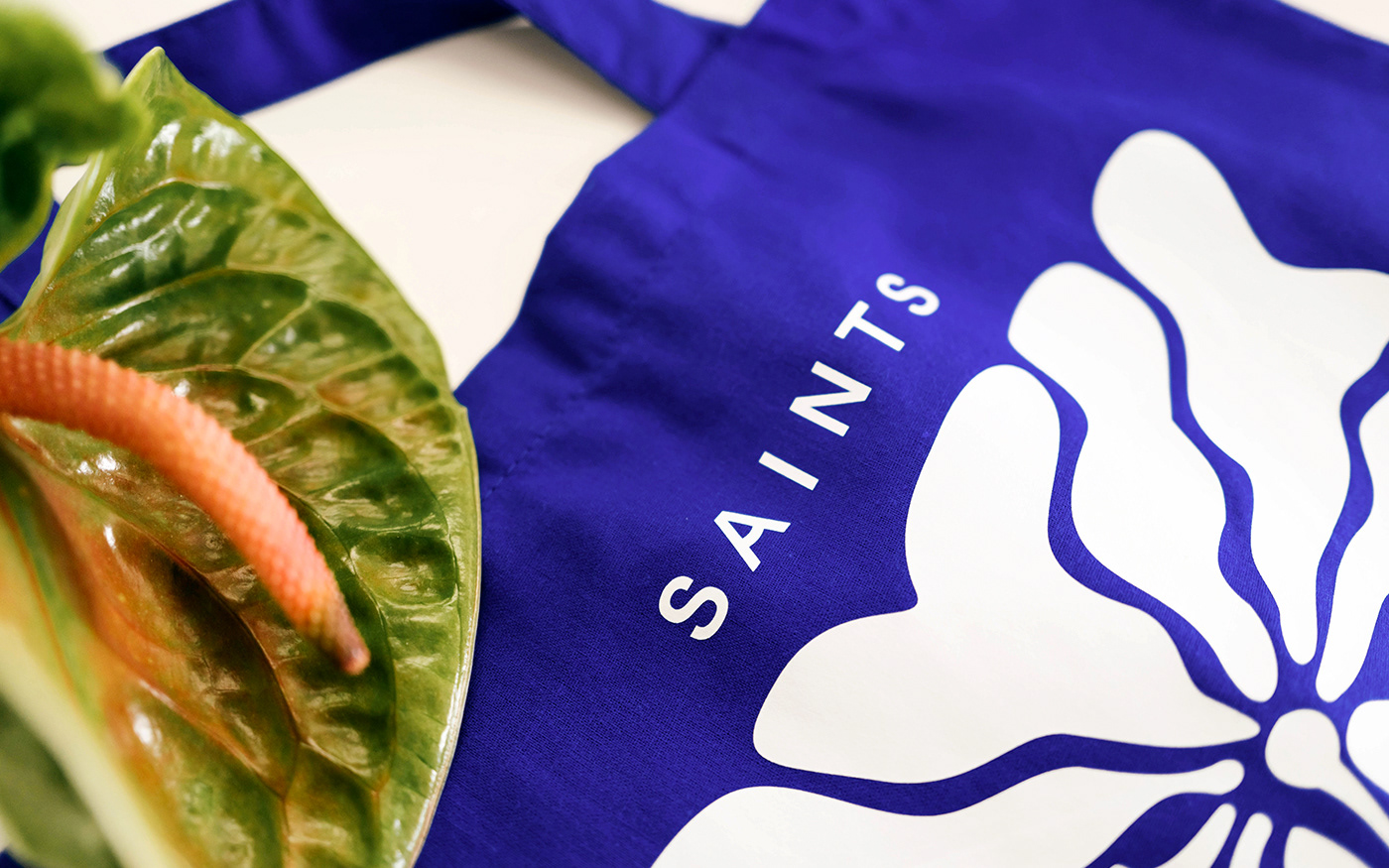
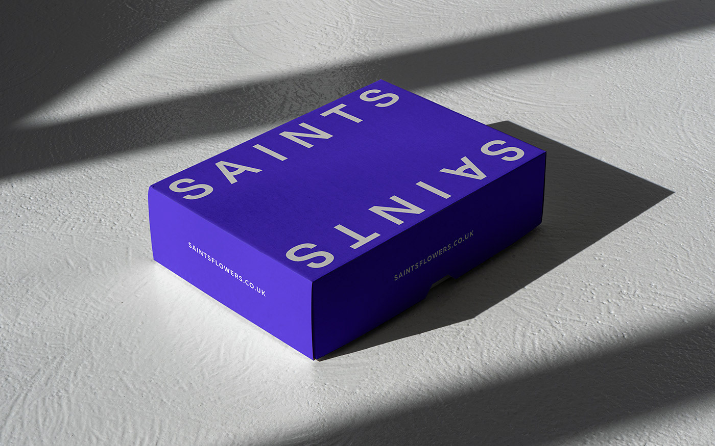
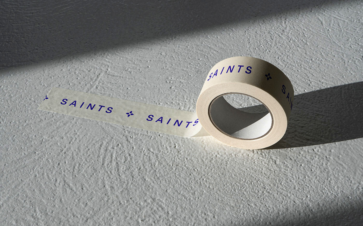
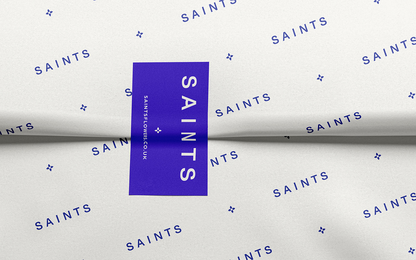
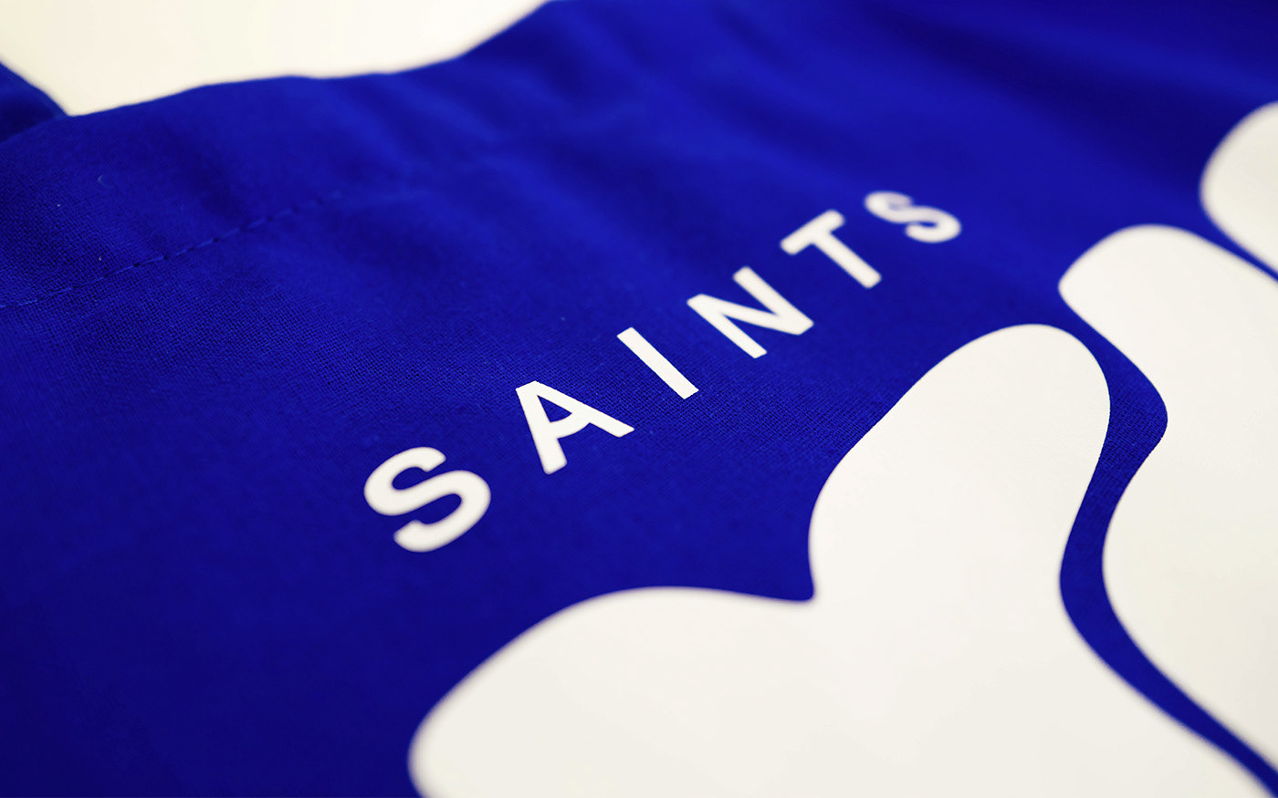
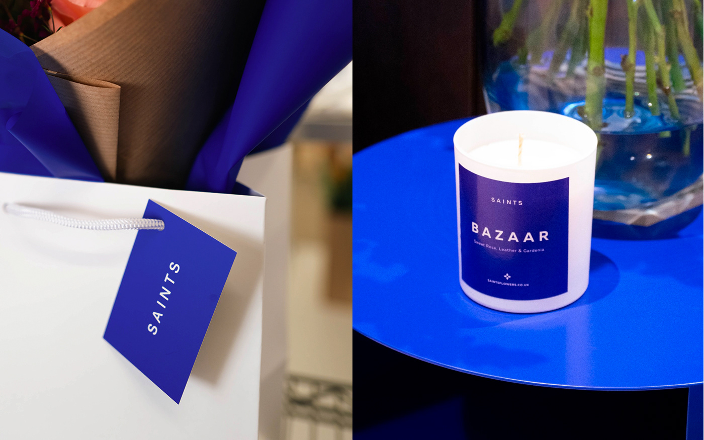
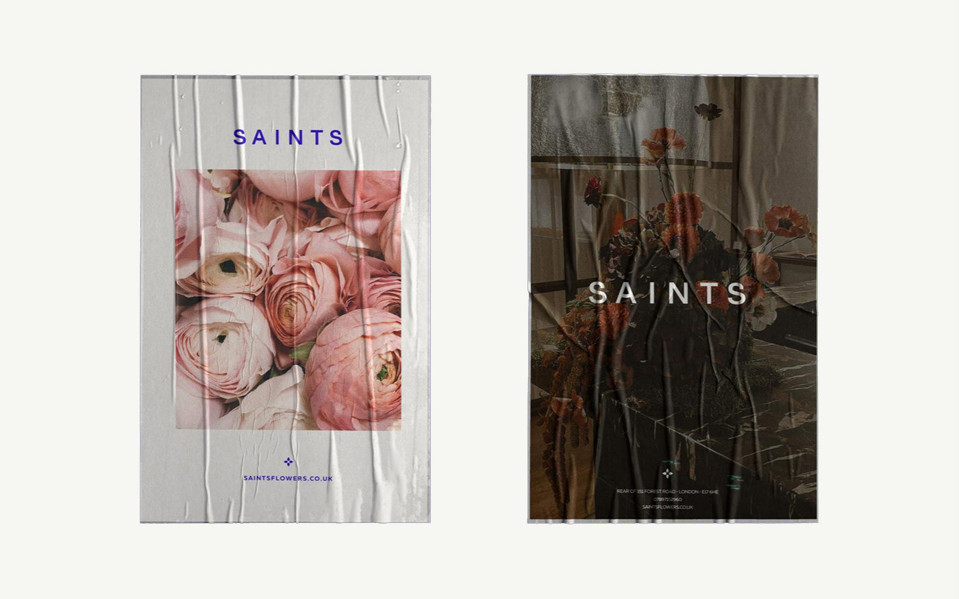
The new visual identity focused on a custom logotype and strong Monotone pallete.
The simplicity of the mark helps the brand breath, resulting in feeling both
accessible and luxurious.
The simplicity of the mark helps the brand breath, resulting in feeling both
accessible and luxurious.
Similarly royal blue is used heavily to emphasise the ownability of the colour.
It strikes a balance between simplicity and impact, creating a strong brand
recognition while allowing flexibility for other branding elements such as photography,
to shine in marketing materials.
It strikes a balance between simplicity and impact, creating a strong brand
recognition while allowing flexibility for other branding elements such as photography,
to shine in marketing materials.
Floral-like abstract illustration paired with the logotype evoke organic forms
without being overly literal. Petals are incorporated more directly into the design, functioning as typographical elements and symbols throughout the visual language.
without being overly literal. Petals are incorporated more directly into the design, functioning as typographical elements and symbols throughout the visual language.
The resulting identity avoids complexity, letting the products be the center of attention, while offering a refined aesthetic.